RPGSeek Logo Selection Part 2
Once again I beg your indulgence and feedback on some logo designs. I took into account all of your feedback and erred on the side of simplicity and readability. Although there were some very stylish logos I really liked (number 1) they were just too hard to read in a banner format. I went back to my artist and had him rework my first choice and even did a bit of an experiment with combining two styles I like. Please pick your favorite from the options below. Click on the image for a larger version.
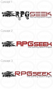

Concept #3 is looking good. But the type may be positioned like Concept #2. That would be better.
I like Concept #3. It is stylish and very readable. Good Luck. Looking forward to the site.
No reason to wait. Rpgseek.com is up and running, it just has an old logo on it.
Trask
I like the last one.
I mean concept 3 in this post.
The mark is a good layout for a web logo, length rather than height is appropriate. The 1st design uses to many fonts for it’s own good, the second and third ones are better choices. I think the third one is the best font choice, but I’d bump the tagline down a bit, it’s riding a little to close to the actual name of the site. Some more integration of the graphic with the text would also me a better presentation, imo. I think its a good direction though. The textures don’t really do anything to help the logo, it’s fine for the website logo, but if you ever make business cards or correspondence to advertise, I’d consider dropping it, might not reproduce very well in print.