Help Me Choose the New Logo for RPGSeek.com
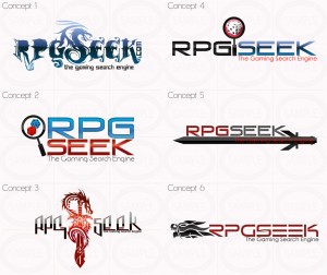
I would like your feedback on which logo design you think is the best for my search engine/link directory for www.rpgseek.com. I have six initial designs from my artist and the ability to make revisions, so any constructive or even destructive criticism is appreciated and it will factor in to my decision on the final version. You can click on the image below for a larger version. Please mention the “Concept number” in your comments.
Trask, The Last Tyromancer
I opt for concept 4!
If I were you, I would go with concept 6. It’s a good design for a logo.
#6.
What I don’t like at all but #1 is that the fant looks to technical and not fantasy enough.
What I like at 2 and 4 is the magnifier.
What I like at 1 and 3 is the Dragon.
Maybe a new design with a magnifier in a Dragon-design and a font that doesnt look so “modern”.
1 or 3 are def awesome in my opinion!
I like #1. The dragon forming the “S” is very cool.
Since you asked…
I am actually a graphic designer!
If I had to pick one of these without revision I would choose option #4. The text is readable and the intent clear.
I am very fond of Option 6 but the typography makes the reading difficult.
Option 1 and 3 suffer from very illegible type.
Option 5 suffers from two issues. The sword is too stylized and the text has a proportion problem in relation to the sword.
Hope this helps.
Option 6.
I do agree that readability could be improved.
Another designer chiming in and just saying David is right on the analysis, some of these other logos would be a complete nightmare to produce on promotional products and print ads, something you need to consider when making a logo